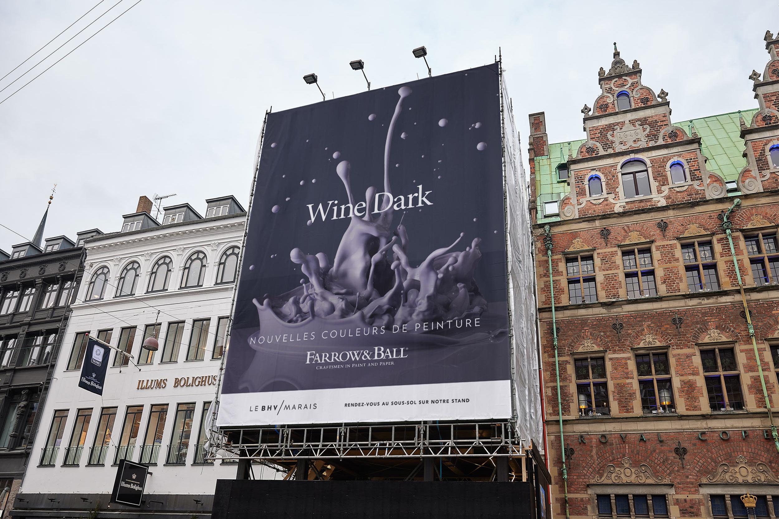
Project Overview
A showcase of Farrow & Ball's new paint colours.
Client:
Farrow & Ball
Project Type:
Typography
Retouch
OOH
Credits:
Studio: BMB
Design: Sam Peel
Creative Direction: Jordan Down & Will Marsden
Year:
2023
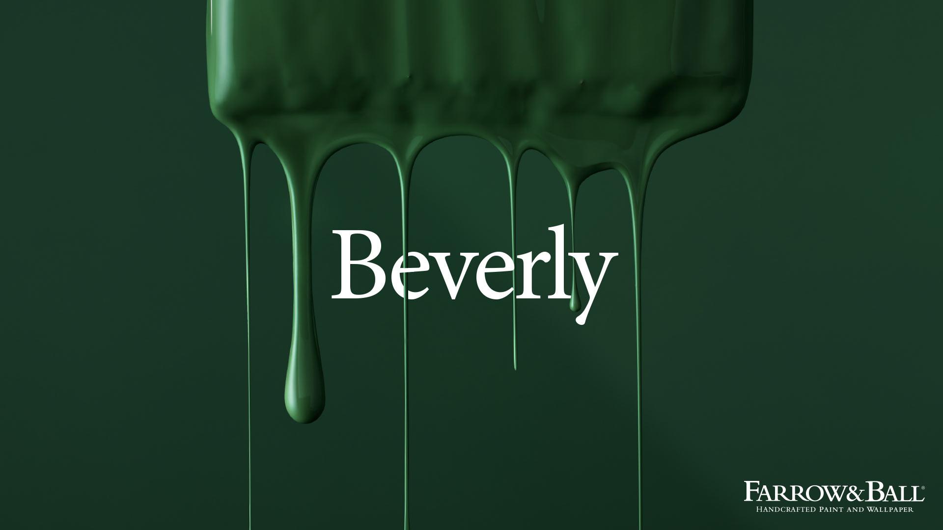
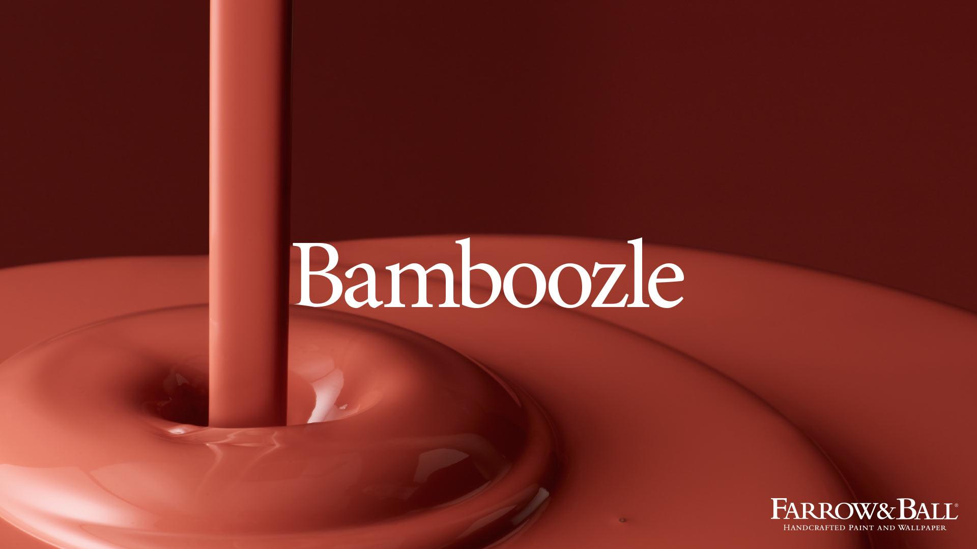
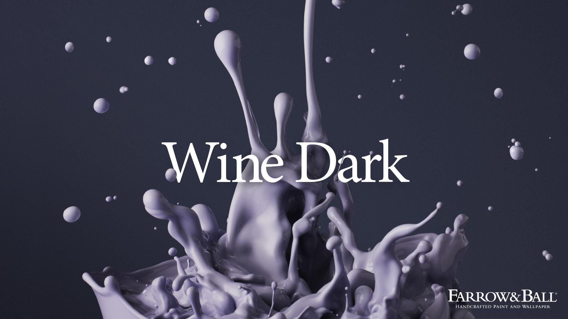
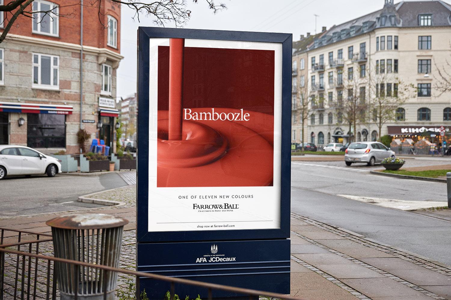
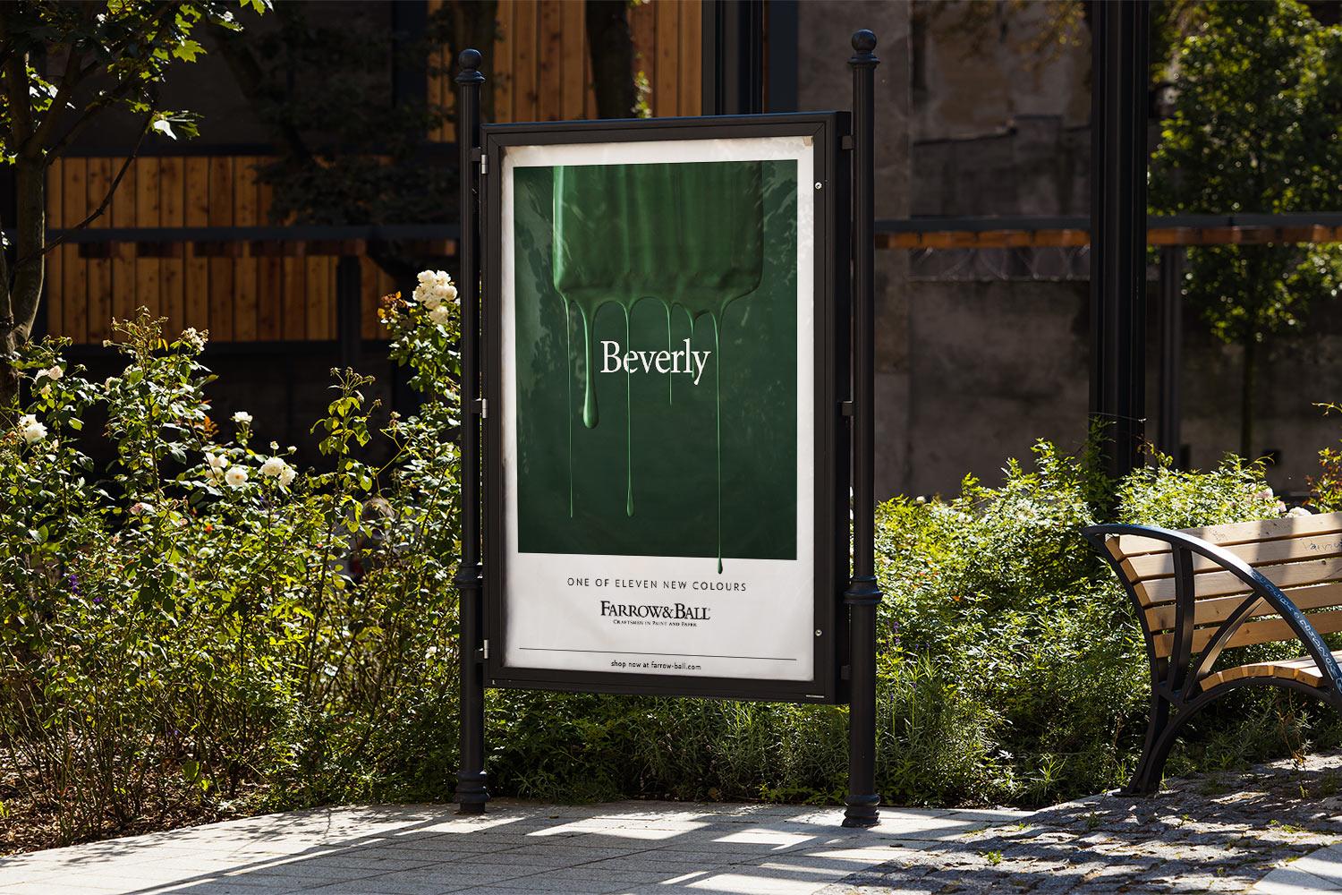
Creating a playful method of introducing the new paint colours.
As part of the BMB team, I was tasked with creating designs for Press Ads and Billboards showcasing the new set of paint colours from Farrow & Ball. This included testing photographic concepts in the early stages, all the way up to laying out the final designs and preparing them for print.
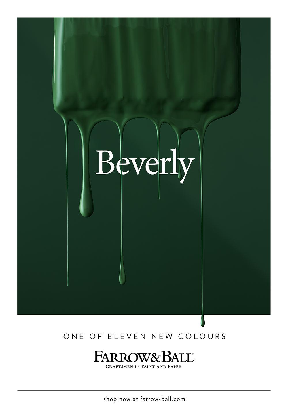
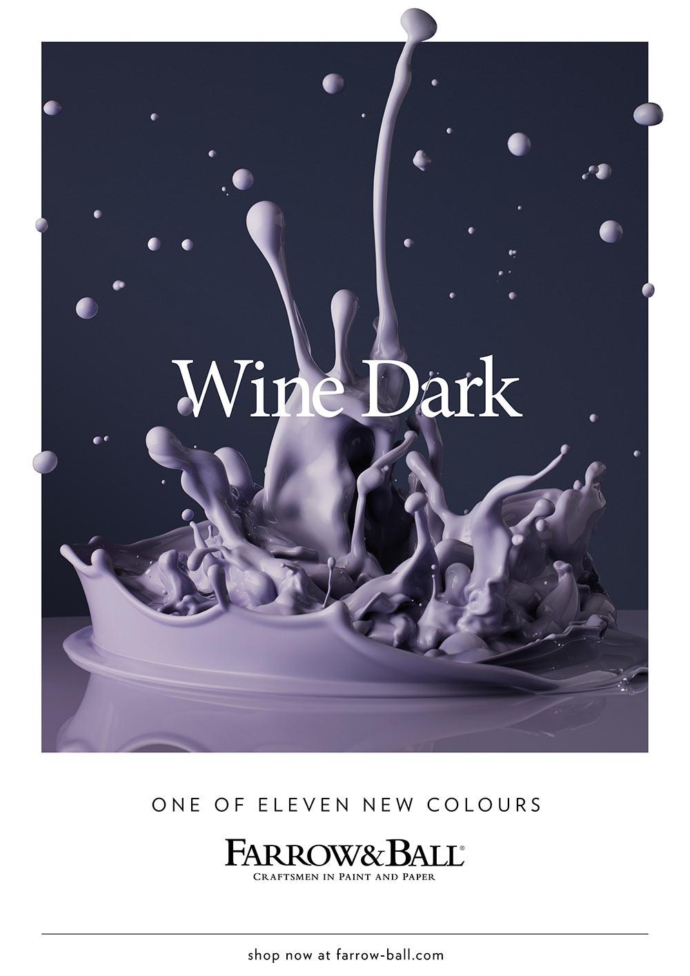
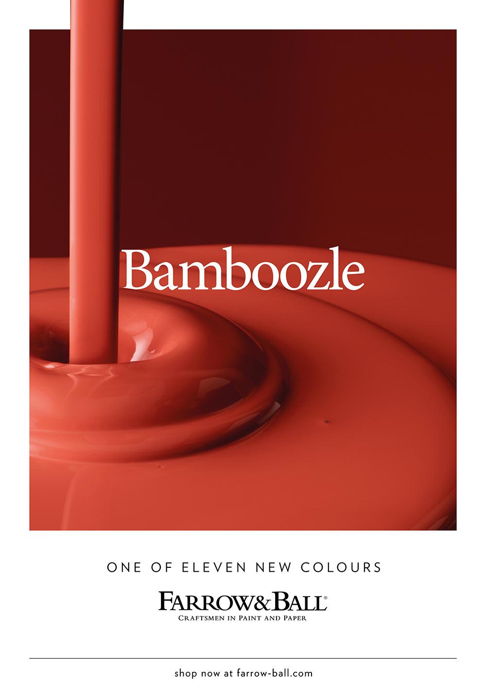
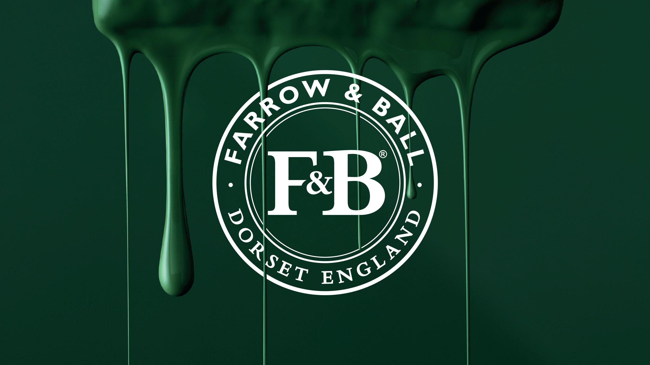
Conceptually, we decided to show the paint in it's raw state, taking influence from food photography rather than the DIY sector. This meant taking shots of paint being mixed, dripped, or poured.
More projects